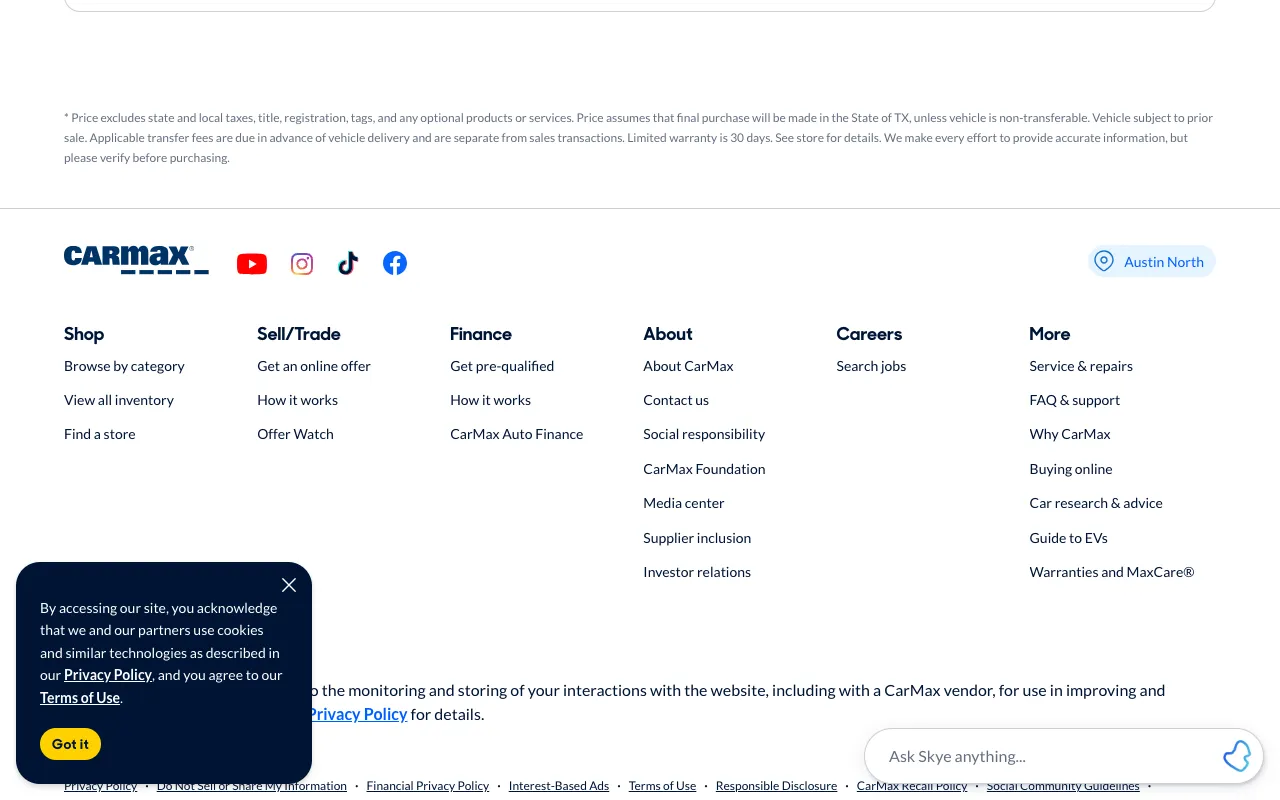
CarMax - Shop for used cars, then buy online or at a store
www.carmax.com
Clicked link “FAQ & support”
For QA and UX teams
Write the task in plain English, like “find the page to cancel a subscription.” FreshVisit starts where a new visitor would, clicks only what your site shows, and keeps every screen. When it gets stuck, your navigation needs work. Run it on a phone to see whether the menu hides the way.
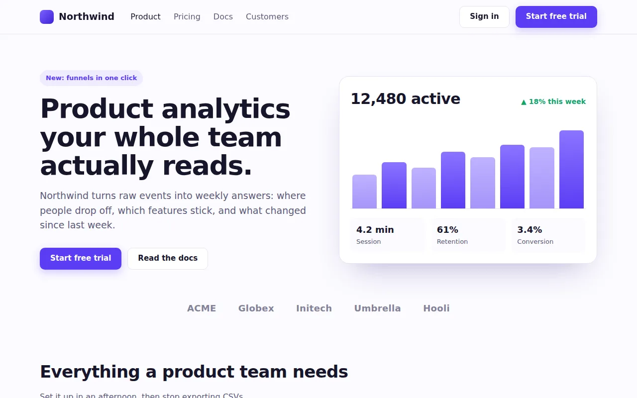
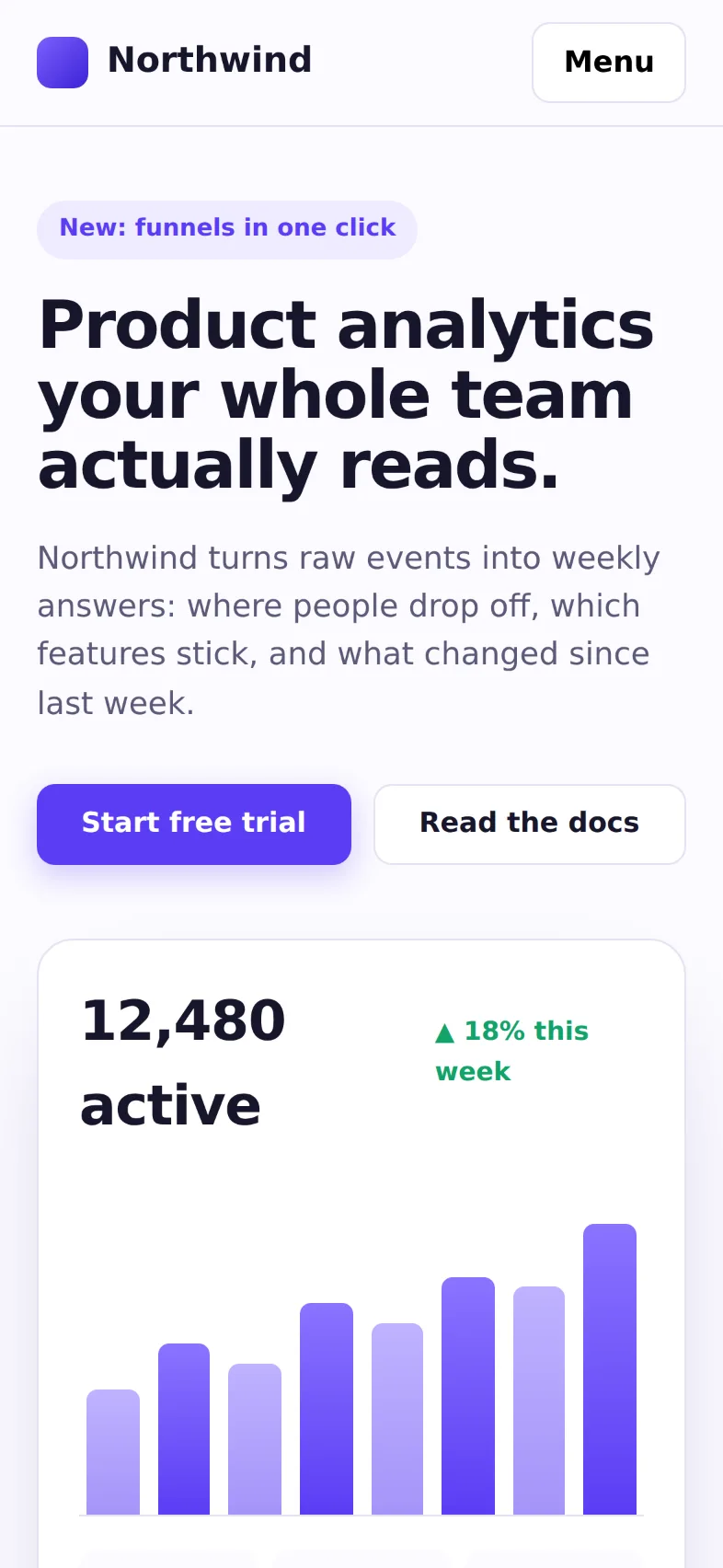
The same task on two screens, on a made-up site
“Find the page that shows the Team plan's price”
Automated tests check that a link works. Usability studies check whether people find it, a few times a year. Everything in between ships unchecked.
Automated tests
An end-to-end script clicks the selector it was given. It never asks whether a visitor would know to click it.
Usability research
Tree tests and moderated sessions take weeks to set up, so they happen a few times a year while the navigation changes every sprint.
Mobile
Pricing sits in the header on a laptop. On a phone it moves behind a menu, and reviews rarely happen on a phone.
How it works
Describe where a visitor wants to end up. A goal journey starts on the page you give it, reads each screen, and clicks what looks most likely to get there. You get a video of the whole run, loading and transitions included, and every screen with the click highlighted.
An automated journey, start to finish
Recorded by an automated browser.
www.carmax.com
Clicked link “FAQ & support”
www.carmax.com/help-center
Clicked link “Buying a Car”
www.carmax.com/faq/buying-a-car
Clicked link “Do I really get 10 days to return the car?”
www.carmax.com/faq/buying-a-car/do-i-really-get-10-days-to-return-the-car
Destination reached
You can bring it back within 10 days to the store where you purchased it
Write the task the way a visitor would say it. No selectors and no recorded clicks, so nothing breaks when the markup changes.
It chooses from the links and buttons on screen by the names a screen reader announces. A control with no accessible name is one it can’t pick.
A click that lands on another site is undone, and it stops at a CAPTCHA or bot check instead of trying to get past it.
Reading a result
A journey ends one of three ways, and two of them are findings.
It reached a screen that answers the task and outlined the passage that does. Count the steps: more clicks than you expected is a finding too.
Nothing it saw looked like the way there, even after backing up and trying other paths, the site’s search included. That’s where a visitor gives up. Check the labels on its last screen.
It kept clicking and never arrived. The path only works for visitors willing to wander. Its screens show which labels pulled it the wrong way.
A journey is one visitor’s reading of your site, not a study. Use it to find the paths worth testing with people.
Every screen size
Run the same task as a laptop, a tablet, and a phone, side by side. On Northwind the phone’s navigation folds behind a Menu button, so reaching the price takes one more step.
On every screen, on a made-up site
northwind.example
Clicked link “Pricing”
northwind.example/pricing.html
Destination reached
Team, for product teams: $29 / seat / month. 1M events a month, funnels and retention, alerts in Slack, 1-year history.
On every release
Put your top tasks on repeat, daily or weekly. A redesign doesn’t break a task written in plain English. It breaks the path, and the run history shows the week it happened, with what changed on the page. On Team, run the same tasks on your staging site, signed in with a test account, before the release ships.
More for QA
Journeys test the path. Audits test the pages: accessibility and consistency across the whole site.
An audit follows your links, up to 24 pages, and runs axe-core on each against WCAG 2.0 to 2.2, A and AA. Failing elements are outlined on the screenshot, with how to fix them.
The same audit compares every button’s computed style across the site and flags the ones that break its pattern.
Share a journey or an audit with one link that opens without an account, or download the run as a PDF. Audit findings come with the failing markup or the CSS selector.
Keep the journeys and audits for checkout, onboarding, or help together, and pin the ones you check most.
What visitors come to do: see pricing, contact support, cancel, find the docs.
Each task is a row in the New journey dialog, up to 5 at once, each with its own start page.
Desktop, tablet, phone, or all three. Each device finds its own way.
Look at what came back Stuck or Out of steps, then put the tasks on repeat.
Try your top tasks on every device at no cost. Paid plans start at $59/month.
No. A journey is one careful visitor reading each screen, and it can’t tell you what people expect or how they feel. Use it between rounds of research to catch broken paths, and to choose which tasks to test with people.
On each screen, an AI model reads the page’s text and its accessibility tree, judges whether the task is done, and picks the link or button most likely to lead there.
Not always. Pages change between runs, and close calls can go either way. Treat one Stuck result as a lead and run it again before you file a bug.
Up to 15 steps per task (10 unless you raise it), within about eight minutes.
Start with a verb, name what the visitor wants, and leave your solution out: “Find the page that shows the Team plan’s price,” not “Click Pricing.”
Yes, for functional jobs. A job story’s “When” sets the start page and the devices, “I want to” becomes the task, and “so I can” is what done looks like. Found and the step count measure the job, and the same task runs on competitors’ sites too. Interviews still find the jobs; journeys test them.
Yes, with Team: it signs in through your product’s sign-in form with a test account, or gets past a staging password or a preview header, before a release ships. On Free and Pro, point it at the live site after each release.
Write them down, run them on every device, and find the dead ends before your visitors do.
Start free